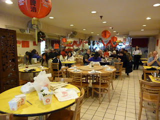
BEFORE...
They had lots of red lanterns hanging...
They posted various red signs on the wall and yellow tables (that weren't going to be replaced)...
And assorted pictures here and there.
During the remodeling...
They removed the wallpaper.
And here are the AFTER pictures...
I selected the wall colors and recommended how to hang the new pictures...
I sewed the black and white panels for them (they were red before).We removed the red menus on the walls.
We removed the red lanterns.
So, now I say it looks a bit more modern and high tech. I love gray with yellow.
I consolidated all the pictures into one frame. I have more to hang up soon.
And this is how the restaurant was last Friday at lunch. It's usually always packed at lunch time...I mean if you don't get there before 12:15pm, plan on waiting for a table. What a fun project this was and I'm so glad everyone enjoys the new look. It's a small restaurant with great food, friendly service, at a great price! If you go there, tell them Connie sent you :-).
Tomorrow, I'll post a couple more 2012 collaborative calendar pages to show you (July & August) - they're fabulous!


the restaurant looks totally transformed. you did an amazing job. especially love the curtains you sewed that link the kitchen to the main dining room. they are fortunate to have had you assist them. again, kudos..
ReplyDeleteDoes that mean you get free lunches? Fabulous job on the restaurant. It looks a lot more pleasing to the eye, and has a more up to date look. Great work!
ReplyDeleteWow I wish you were close to Ft Lauderdale....my family has a failing restaurant and I think a makeover is just what we need :) You did a beautiful job!! Ash1020@comcast.net
ReplyDeleteI like the remodeling done for your restaurant. It looks more rich and stylish. The pale yellow makes a good sense.
ReplyDeleteremodeling companies